Why Your Print Looks Different From Your Screen (And How to Fix It)
You've chosen your photo, picked the perfect paper, and placed your order. Then the print arrives — and the colours look… off. The sunset isn't as vivid. The shadows are darker. The whole image feels different from what you saw on your laptop. What happened?
Nothing went wrong. What you're experiencing is one of the most common surprises in photo printing, and it has a straightforward explanation. Screens and prints display colour in fundamentally different ways. Once you understand why, you can prepare your photos to bridge that gap — and feel confident about every order.
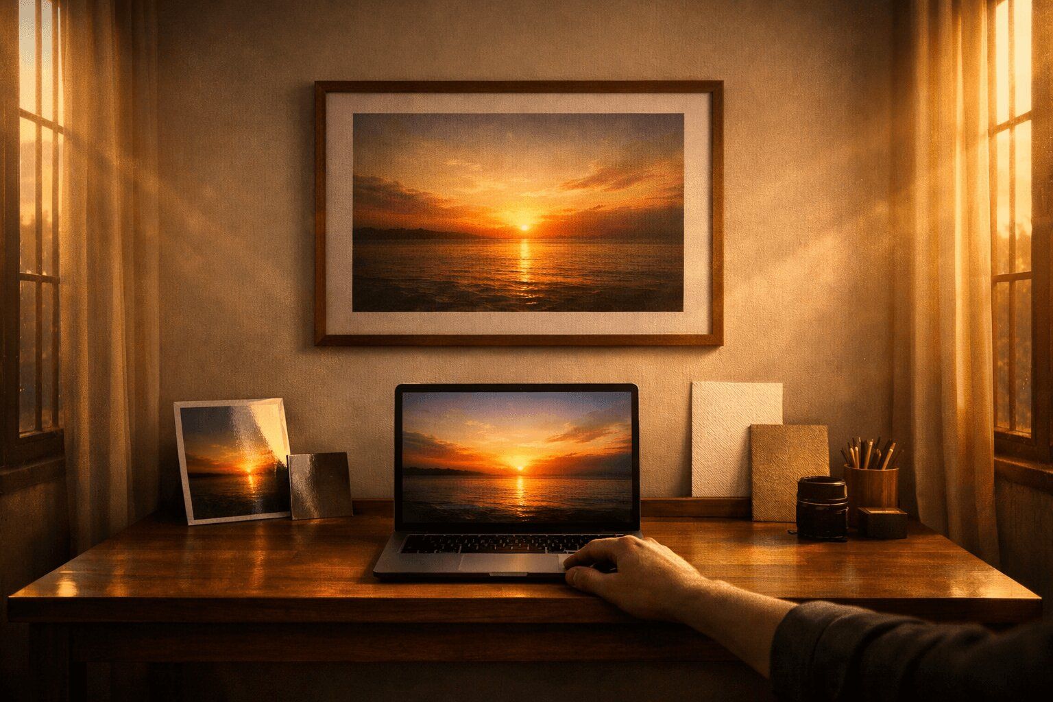
Screens glow. Prints reflect.
This is the core of the issue, and it's worth understanding properly.
Your screen creates colour by emitting light. It blends red, green, and blue pixels (RGB) at varying intensities to produce millions of colours. When you look at a photo on your phone or monitor, you're looking directly into a light source. That's why images on screens appear vibrant, punchy, and luminous — the screen is literally shining the image into your eyes.
A print does the opposite. It sits on paper and relies on ambient light in the room — sunlight through a window, a ceiling lamp, a desk light — bouncing off the surface. The paper absorbs some wavelengths and reflects others, and that reflected light is what you see as colour.
This difference is not a flaw in the print or the printer. It's physics. A printed photo will never glow the way a screen does, just as a screen will never have the tactile, physical presence of a print on your wall. They're different mediums, each with their own strengths.
Your monitor is probably too bright
Here's something most people don't realise: the display on your phone, laptop, or monitor is almost certainly set far brighter than the environment where you'll view your print.
Manufacturers ship screens with brightness cranked up because it looks impressive in a shop. That bright, saturated display catches your eye on the shelf at JB Hi-Fi. But it doesn't represent how a printed image will look under normal room lighting.
When you edit or view a photo on an overly bright screen, you're seeing shadow detail that won't be visible in print, colours that appear more saturated than any paper can reproduce, and an overall luminosity that no physical object can match.
This is the single biggest reason people feel their prints look "too dark." The print is usually fine — it's the screen that was misleading.
The quick fix: Turn your screen brightness down to about 50–60% before reviewing photos you plan to print. This gets you much closer to what you'll see on paper. If you're on a Mac, the built-in Display Calibrator (System Settings > Displays > Colour Profile) can help. On Windows, search for "Calibrate display colour" in Settings.
You don't need professional calibration hardware to see a significant improvement. Just reducing brightness gets you 80% of the way there.
The colour space gap
If you've ever heard the terms sRGB or Adobe RGB and tuned out, this is worth a quick read : it directly affects your prints.
A colour space defines the range of colours available in your image. Think of it as a box of crayons. sRGB is a standard box of 64 crayons, it covers the colours most screens can display and most printers can reproduce. Adobe RGB is a bigger box of 128 crayons : it includes more greens and cyans, which can be useful for printing but aren't visible on most screens.
The problem occurs when your photo is saved in a colour space your printer or screen can't fully interpret. Colours outside the available range get "clipped" to the nearest equivalent, which can cause subtle shifts, particularly in greens, teals, and deep blues.
The practical advice: Unless you're a professional photographer with a calibrated wide-gamut monitor, stick with sRGB. It's the safest colour space for consistent results between screen and print. When exporting from Lightroom, Photoshop, or Apple Photos, check that your colour space is set to sRGB before saving.
If your photo was taken on an iPhone or most Android phones, it's already in sRGB. You don't need to do anything.
JPEG, TIFF, and RAW: does the file format matter?
Yes, but less than you might think.
JPEG is by far the most common format and works well for printing. The compression is minimal at high quality settings (10–12 in Photoshop, 85–100% elsewhere), and the difference between a high-quality JPEG and a TIFF is essentially invisible in the final print.
TIFF preserves slightly more data and is preferred for archival or professional work. If you're exporting from Lightroom or Photoshop and want the absolute best quality, TIFF is a safe choice. The files are much larger, but they avoid any compression artefacts.
RAW files contain the most data straight from your camera sensor. We accept RAW uploads, which gives us maximum flexibility to produce the best possible print.
For most people, a high-quality JPEG is perfectly fine. Don't convert to TIFF if your original is already a JPEG — you won't recover data that was already compressed.
Why some colours shift more than others
Not all colours behave the same way when moving from screen to print. Some translate almost perfectly. Others shift noticeably.
Colours that print well include warm tones like reds, oranges, and yellows, neutral tones and skin tones, earth tones and muted palettes, and black and white (which tends to look stunning on matte papers like our Textured Cotton Rag).
Colours that can shift include highly saturated blues and cyans, neon greens and electric teals, very deep purples, and any colour that looks almost "glowing" on screen.
The reason is that these ultra-vivid colours often exist at the edge of what a screen can display — and beyond what any ink-on-paper combination can reproduce. The printer does its best to find the closest match, but a neon blue on screen might become a rich, deep blue in print. It's still beautiful — just different.
If your photo has a lot of these tricky colours, that's a good case for using our Professional Review option. For $10, we assess your image before printing and can flag any areas where colour shifts might be noticeable.
The paper changes everything
The paper you choose has a dramatic effect on how colours appear. This is something most people underestimate.
Glossy papers (like our Photo Realistic Gloss) produce the widest colour range and the deepest blacks. Colours look their most vivid and saturated on gloss — it's the closest you'll get to matching the punch of a screen. The trade-off is reflections under direct light.
Matte papers (like our Textured Cotton Rag) produce softer, more understated colours with lighter blacks. This isn't a limitation — it's an aesthetic choice. Matte prints have an elegant, gallery-quality feel. But if you're expecting screen-level saturation, matte will feel subdued by comparison.
Semi-gloss/lustre papers (like our Smooth Pearl) sit in the middle — good colour saturation with minimal glare. This is why Smooth Pearl is our most popular paper for everyday prints. It balances vibrancy and practicality.
Metallic papers (our Metallic Gloss) add a pearlescent shimmer that makes highlights glow. This can actually make certain images — water, snow, light sources — look more vivid than on screen. It's a unique effect that doesn't have a screen equivalent.
If you're unsure which paper will best match what you see on screen, our paper guide breaks down each option in detail.
The lighting in your room matters too
Here's something people rarely consider: the same print will look different depending on where and how it's lit.
Under warm tungsten bulbs (the yellowish light in most Australian living rooms), colours shift warm. Whites look creamy. Blues look slightly muted. Under cool LED or fluorescent light, colours shift cooler. Whites look bluer. Reds can appear slightly muted. In natural daylight, colours appear closest to neutral — this is where most prints look their best.
Gallery lighting isn't an accident. Museums use carefully controlled, colour-neutral lighting because it makes prints and paintings look as intended.
You don't need gallery lighting at home. But it's worth knowing that if your print looks slightly different in the hallway versus next to the window, it's not the print — it's the light.
A realistic expectation
Here's the honest truth: a print will never look identical to a screen. They are different mediums showing the same image. That's not a failure — it's the nature of the craft.
But a well-prepared photo, printed on quality paper with calibrated equipment, will look beautiful. Often in ways a screen can't match. The depth of a matte cotton rag print, the shimmer of metallic paper catching the light, the way a large format print transforms a room — these are experiences that don't exist on a screen.
The goal isn't pixel-perfect screen matching. It's a print that looks stunning on your wall.
Before you upload: a quick checklist
Turn your screen brightness down to 50–60% and review the photo. If it still looks good, it'll print well.
Check your colour space. sRGB is safest. If you're exporting from editing software, select sRGB in the export settings.
Export at high quality. JPEG at 90–100% quality is fine. TIFF if you want maximum data.
Don't over-edit. Heavy saturation boosts and extreme contrast adjustments on screen often look unnatural in print. If anything, err slightly on the side of natural. What looks "a bit flat" on a bright screen often looks perfect on paper.
Avoid photos that are heavily backlit or very dark. Shadow detail that's barely visible on a bright screen may disappear entirely in print. If you need to squint to see detail on screen, it won't survive the transition to paper.
Consider the Professional Review. If you're ordering a large print (A1 or A0) or the image means a lot to you, our $10 review gives you expert eyes on the file before it goes to press. We'll flag anything that might not translate well and suggest adjustments if needed.
Ready to print?
Your photo looks great. You understand why screen and print differ. You've checked your file. Now let it become something real.
Upload your photo, choose your size and paper, and we'll handle the rest — printed on calibrated equipment, on premium Ilford papers, and shipped to your door from Melbourne.